Hero Type 9
Staying Connected
The above block is copied from the site: https://cascadefinadev.wpenginepowered.com/charity-and-community/
Pattern HTML
<!-- wp:group {"metadata":{"name":"Hero Panel #1"},"align":"full","className":"responsive-hero-section","style":{"elements":{"link":{"color":{"text":"var:preset|color|one"}}}},"backgroundColor":"two","textColor":"one","layout":{"type":"default"}} -->
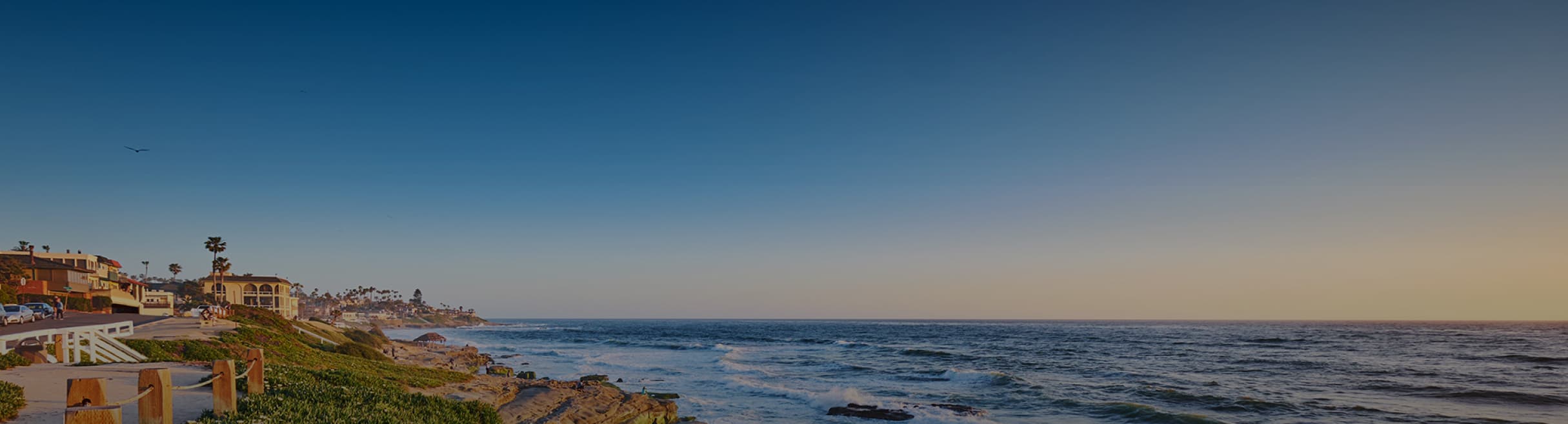
<div class="wp-block-group alignfull responsive-hero-section has-one-color has-two-background-color has-text-color has-background has-link-color"><!-- wp:acf/responsive-picture {"name":"acf/responsive-picture","data":{"desktop_image":2649,"_desktop_image":"field_68fc75d331296","tablet_image":"","_tablet_image":"field_68fc760731297","mobile_image":"","_mobile_image":"field_68fc763331298"},"mode":"preview"} /-->
<!-- wp:group {"metadata":{"name":"Hero Content"},"animationsForBlocks":{"animation":"fade","variation":"right","once":true,"mirror":false,"easing":"linear"},"className":"hero-content","style":{"spacing":{"blockGap":"var:preset|spacing|15"}},"layout":{"type":"constrained","contentSize":"1330px","wideSize":"100%"}} -->
<div class="wp-block-group hero-content" data-aos="fade-right" data-aos-easing="linear" data-aos-once="true"><!-- wp:heading {"textAlign":"center","level":1,"className":"reduce-for-mobile","style":{"elements":{"link":{"color":{"text":"var:preset|color|one"}}}},"textColor":"one"} -->
<h1 class="wp-block-heading has-text-align-center reduce-for-mobile has-one-color has-text-color has-link-color">Staying Connected <br>With the Community</h1>
<!-- /wp:heading -->
<!-- wp:heading {"textAlign":"center","level":4,"style":{"elements":{"link":{"color":{"text":"var:preset|color|one"}}}},"textColor":"one"} -->
<h4 class="wp-block-heading has-text-align-center has-one-color has-text-color has-link-color">A lasting impact beyond financial goals</h4>
<!-- /wp:heading --></div>
<!-- /wp:group --></div>
<!-- /wp:group -->
Pattern CSS
.upt-responsive-picture {
	display: block;
}

.responsive-hero-section {
	position: relative;
	overflow: hidden;
    min-height: 436px;
    display: flex;
    flex-direction: column;
    justify-content: center;
    padding: 50px 0;
}

body.home .responsive-hero-section {
    min-height: 850px;
	justify-content: flex-end;
	padding-bottom: var(--wp--preset--spacing--110);
}

.cta-section{
	position: relative;
	overflow: hidden;
	flex-direction: column;
    justify-content: center;
    padding: 105px 0;
}

.responsive-hero-section .upt-responsive-picture img,
.cta-section .upt-responsive-picture img{
    display: block;
    border: none;
    bottom: 0;
    box-shadow: none;
    height: 100%;
    left: 0;
    margin: 0;
    max-height: none;
    max-width: none;
    object-fit: cover;
    outline: 0;
    padding: 0;
    position: absolute;
    right: 0;
    top: 0;
    width: 100%;
	object-position: center bottom;
}

.cta-section .gform_wrapper.gravity-theme .gfield_required{
	color: var(--wp--preset--color--one);
}

.responsive-hero-section .hero-content {
    margin-top: -12px;
}

.block-editor-block-list__block.wp-block-acf-responsive-picture * {
    width: 100%;
    height: 100%;
    display: block;
    min-height: 100% !important;
}

.block-editor-block-list__block.wp-block-acf-responsive-picture {
    position: unset !important;
}
@media only screen and (max-width: 780px) {
	.responsive-hero-section{
		min-height: 336px;
	}
}
